
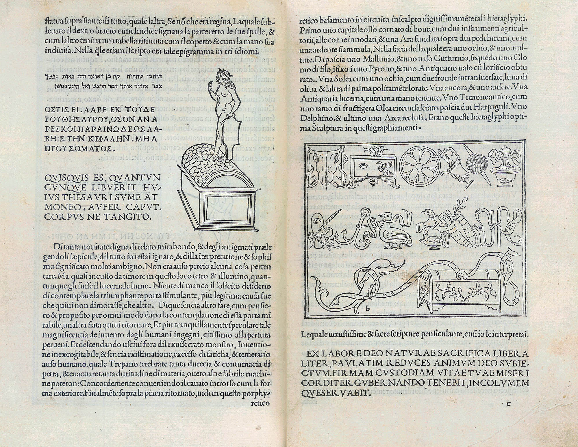
Typographical
—...of letters, of characters, of chiselled marks—
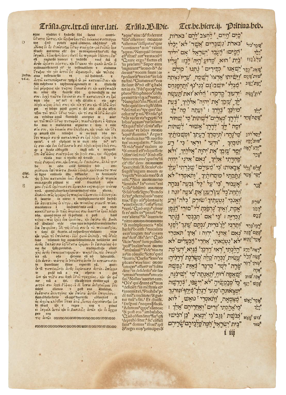
Jeremiah I:3 Complutensian Polyglot Bible
Norbiton: Ideal City is a place not so much of stones, of paving and brick and architecture, as it is of letters, of characters, of chiselled marks; in short, a place of words.
But words, like cities, or buildings, or people, do not hover in undifferentiated space. They are placed in relations clear or ambiguous, are arranged in sequence loose or calculated: they become what they are only in concert.
And what is it that holds them in place? The whiteness of the page is no help. Words, unanchored, would drift in immensity, the ink would drip and blot, an entropy of sound. A poet might seek to make her words adhere by the operation of interior stickiness, rhyme, assonance, metre. But Norbiton? No. We know our limitations. The prose of Norbiton is shepherded into its lucid pens (sentence; paragraph; section; page), word tumbling and bleating over word, by scores of analphabetic signs, as follows:
- punctuation (stops, pauses, spaces; dashes en and em; pilcrow and octothorpe; square bracket and parentheses; dancing men and manicules)
- superscripts
- diacriticals (tilde, ogonek, accents acute and grave &etc.)
- fonts and typefaces
- code: angle brackets, class, style, div, blockquote, lists ordered and unordered. html
In setting his great polyglot bible of 1569-72 (in eight folio volumes), Christophe Plantin uses sometimes as many as four different ampersands in the course of a single paragraph: he saw that the unspoken, the ineffable, must surround the spoken as angels and spirits surround the head of the prophet, or as irrational numbers swarm the interstices of the rational: the words, without their analphabeticals, would slip off the page of history, trudge into exile along with the carts and straggling refugees of the Ideal City itself. What is the Babylonian exile, after all, if not an exile of the Word into Babel, where language bleeds into language, word into word, and where the medley of imcomprehensible tongues is nothing more than a flow of undifferentiated, unpunctuated sound?
![]()
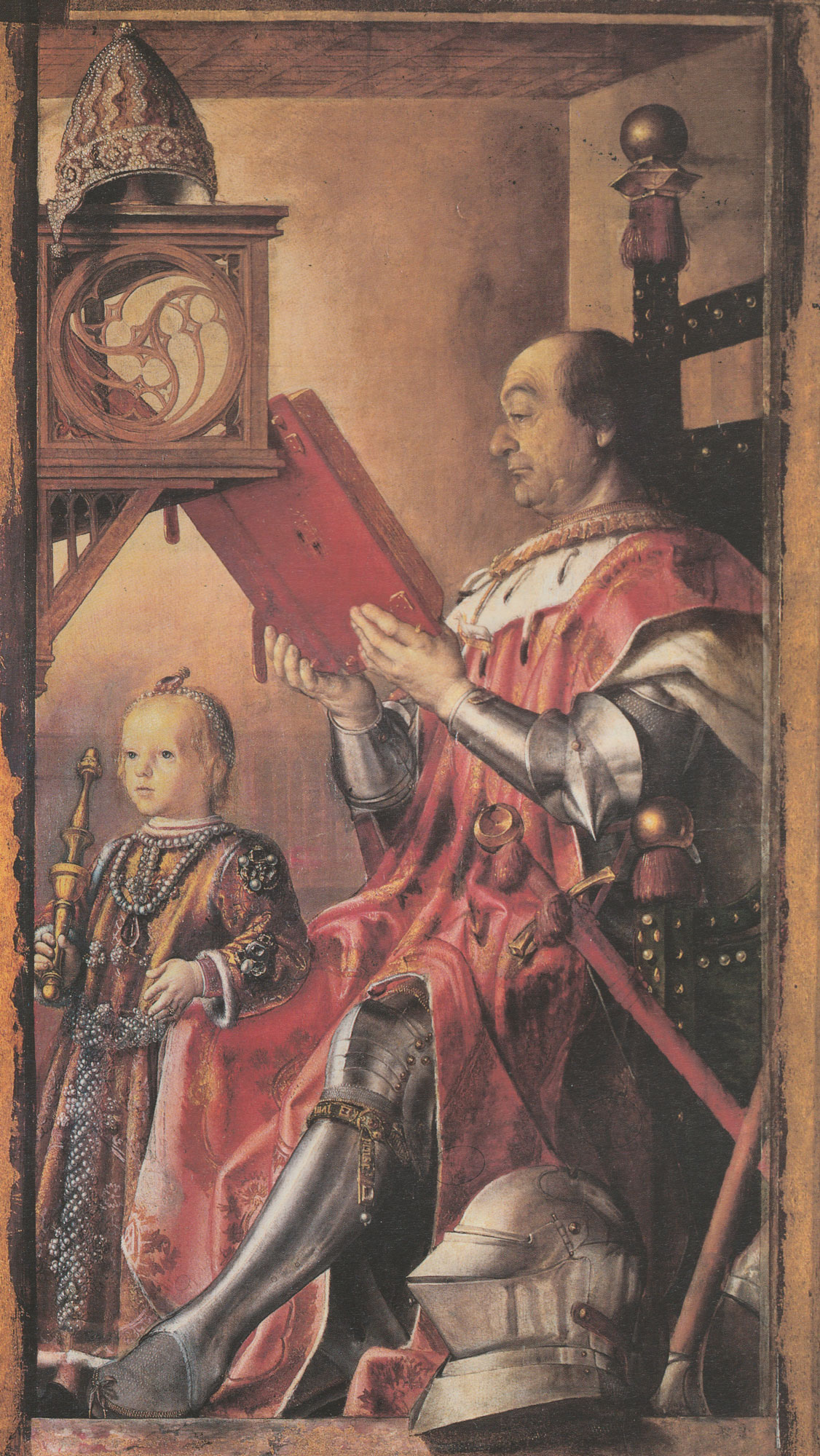
Federico da Montefeltro, clanking humanist warlord of the quattrocento, would have baulked at a mere four ampersands: he refused to have the new-fangled printed books in his library at all. He considered them vulgar.
—clanking...vulgar—
Federico da Montefeltro and son, Pedro Berruguete or Justus of Ghent
The Duke, having completed this noble work [his library at Urbino] at the great cost of thirty thousand ducats, beside the many other excellent provisions that he made, determined to give every writer a worthy finish by binding his work in scarlet and silver. … In this library all the books are superlatively good, and written with the pen, and had there been one printed volume it would have been ashamed in such company. They were beautifully illuminated and written on parchment. This library is remarkable amongst all others in that, taking the works of all writers, sacred and profane, original and translated, there will be found not a single imperfect folio.
Renaissance Art Reconsidered: An Anthology of Primary Sources, eds. Carol M. Richardson, Kim W. Woods, and Michael W. Franklin (Oxford: Blackwell, 2007), pp. 326–9.
The Duke was resisting the tide of incunabula1, the printed books of the early Renaissance which approximated in design, in font, in layout, to the handwritten, hand-copied manuscripts which he knew. To Montefeltro, a printed book was a simulacrum of an actual book; actual books—handwritten books—had an apostolic authority, handed, quite literally, down the generations, and the library at Urbino was in consequence as much talismanic arrangement as clearly-ordered store of knowledge.
But the Duke was wrong. If a handwritten book is a book born of the slowness and mysticism of the monastery, printed books create a fresh and invigorating triangle of relations, between the author, the typesetter, and the bookseller—relations free, potentially at least, of the patronage of great clanking princes. By the mid sixteenth century, the book is something other. Sharper. More technological. More atomic. More distinct from the world which bore it.
And type, anyway, can cast its spell. The words it transfers to the page are acheiropoetic, untouched by human hands. For as long as I remember, my father had an old Olivetti portable typewriter which lived in a blue-grey case, mostly unopened, under his desk. When I was a small boy I would sometimes roll a sheet of paper into this machine and batter out my favourite chunks of text from dinosaur books, smudged, misaligned, miscopied, with random biblical red-letter. There was only one monospace font: slabs of letters, unkerned, so many to the pica. I did not care. It represented a magical transformation. My goofy irregular untidy handwriting translated into something precise, something machined: something indistinguishable (to my eyes) from the texts of the adult world, which lay always on the horizon.
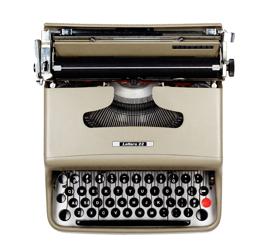
—magical transformation—
– photo: Austin Calhoon (http://austincalhoon.com) [CC BY-SA 3.0 (https://creativecommons.org/licenses/by-sa/3.0) or GFDL (http://www.gnu.org/copyleft/fdl.html)], via Wikimedia Commons
![]()
A printed book, says Clarke, is a tomb, buried inside which is a memory of the handwritten letter. Just as, in an adult, there is a dead child.
We are standing, Veronica di Viggiani and I, in a corridor of Kingston Hospital, showing Clarke the black-and-white ultrasound image of our first-trimester child.
Clarke holds the images between his fat thumbs but he does not look at them. He is having a book published, and has just received the proofs. He is clutching them under his arm, like a nervous father, his mind dancing with thoughts of font and margin, of the ink settling into the fibrous paper; he does not really have the mental flexibility, right now, to take in just another little human at a hugely generalisable moment of life, not when that child is set against the fine-grained, mutant particularity of his own creation.
The book, I learn, is to be entitled Atlas of Norbiton.
—Atlas of Norbiton—
![]()
I notice, glancing at a page of his proofs which Clarke holds up for my close inspection, that Clarke uses en dashes to set off phrases rather than em dashes. He is, in this, and to my chagrin, rather more Classical than I am. The em dash is usually not separated by spaces from the words or phrases it itself separates, while the en dash is. Robert Bringhurst regards use of the em dash as a moral failing:
“The em dash was the nineteenth century standard and is still prescribed in many editorial style books, but such long dashes were rare in European printed books before the end of the seventeenth century, when typography was losing its serenity and reserve.”
Robert Bringhurst, The Elements of Typographic Style p.80
I find that I have, at some point, gravitated to the use of the em dash over the en dash. I believe the em dash is the Oxford standard, although my information on this might be out of date. But my choices were clearly made without regard to historical conformity. Would Claude Garamond or Nicolas Jenson have recognise the proliferation of long straight lines in a text as admissible? I doubt it. But as to serenity and reserve, it is true that Laurence Sterne, at the end of the 18th century (century of John Baskerville and William Caslon), interlaces his prose along a seemingly continuous line of em dashes, which he uses as a sort of shorthand for all punctuation, an emblem of rapidity. Quite without reserve, thus:
“If I mend at this rate, it is not impossible—by the good leave of his grace of Benevento’s devils—but I may arrive hereafter at the excellency of going on even thus;
———————————————————————
which is a line drawn as straight as I could draw it, by a writing master’s ruler, (borrowed for that purpose) turning neither to the right hand or to the left.
This right line,—the path-way for Christians to walk in! say divines—
—The emblem of moral rectitude! says Cicero—
—The best line! say cabbage planters—is the shortest line, says Archimedes, which can be drawn from one given point to another.—
I wish your ladyships would lay this matter to heart, in your next birth-day suits!
—What a journey!
Pray can you tell me,—that is, without anger, before I write my chapter upon straight lines—by what mistake—who told them so—or how it has come to pass, that your men of wit and genius have all along confounded this line, with the line of gravitation?"
Gravitation—and Sterne is obsessed with ideas both of gravity and of gravidness—is equated here with digression. He is not able to keep to the straight narrative, but dilates upon this or that. Gravity emerges in the non-direct, the tale of a cock and a bull. And since he peppers even this, his digression on straight lines, with as many extravagant em dashes as he can manage, we have to conclude, I think, that the words themselves (so many deviations from the straightforward em dash), and in short, the writing, are the locus of gravity in his text. All writing, in other words, and by extension all printing, is, at heart, errant.
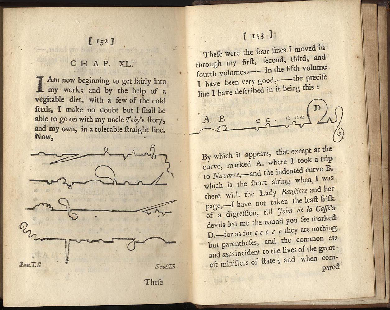
—errant—
Tristram Shandy, Chapter XL
![]()
And indeed, the word typographical so often entails the word error. Clarke, for instance, points to an error in his proofs, rolls his eyes. A typo. Two letters reversed. As though, says Clarke, they wanted to lay a hex on his book. Hard wire some error into the circuitry, something tricky to trace, but blocking the flow of textual energy. He tuts. Smiles. He has found the error, after all.
But he is wrong, anyway, to worry. The philosopher Bruno Latour has noticed the stabilising effect of print on knowledge. If print does not guarantee textual accuracy (as witness Solomon’s editing project, aborted in Restorational, see here), it does allow the proliferation and widespread dissemination of self-similar editions, and allows different versions of a text to be placed simultaneously under the nose of a scholar. Variorums can be drawn up, genealogy of error traced.
Print, in short, creates an institution of knowledge which can be policed, administered, gardened. Clarke has now entered that garden. His grumbling discontents have been tidied away. And he knows it.
![]()
I do not know if Clarke’s Atlas of Norbiton, like the Anatomy, is to be alphabetised; an atlas, presumably, is more variously structured, being determined in effect by the contours of the lands it must parse;—and in truth, the Anatomy is not an anatomy at all; it is not, in other words, a logically hierarchised analysis and laying out of structure, but a crisp encyclopaedic, alphabetised, hence effectively randomised, survey—perhaps the word is sample—of a complex phenomenon: the Ideal City.
Unless, that is, we recognise that the alphabet is in fact the underlying structure of the Ideal City: to anatomise the ideal city is to alphabetise it, and vice versa.
Which is as much as to say, the Ideal City is, like any page of printed matter, a temporary settlement. Sorts of type are drawn from their wooden compartments and shelves, and are set in a form; choices are made about typeset and font size and kerning and justification; about italic and roman; and the page is printed. Page after page after page. But when the printing is done, the letters are broken up, cleaned, replaced. Permanence is underwritten by impermanence.

—permanence underwritten by impermanence—
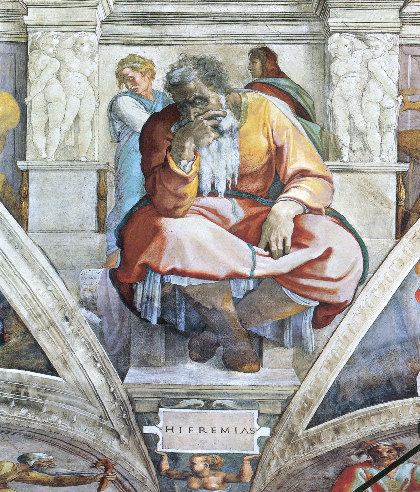
Jeremiah Lamenting the Destruction of Jerusalem,
Rembrandt van Rijn
![]()
Even so, at the heart of this technology, this mechanisation, this automation, there is a craft, a slowness. A dead craftsman, if you like; a dead punchcutter, interred.
A fresh-printed page is already a palimpsest of a deep-lying process. Each moveable piece of type was cast in a mould, or matrix, of copper; the matrix had in turn been stamped out by a punch. The punch had to be tempered, the matrix annealed. Many stages, then, of transfer, positive to negative space, through a progression of metals, tempered to annealed, copper to lead, lead to paper, paper, if you’re lucky, to grey matter.
A slow process. Detailed work. Monastic, even. Take Francesco Griffo, for instance, punchcutter to the great Venetian printer Aldus Manutius, carving new italic fonts. A new font, beautiful and ornate.
It takes a full day to create a single letter. Is it a sunny day? Are there sounds from the canals outside the window? People shouting, splashing oars? Is our punchcutter a bit too warm, a bit too chilly? Is he thinking about his lunch, or about the wine he will drink later—the routines of daily life which hold him in place, like so much punctuation, analphabeticals of habit—or about the cramp in his hand and how he would like to throw up this thankless trade of carving tiny letters, and go in for something in gun metal, artillery, the new science. Or is he simply, for a few moments together – you can almost see the little slivers of fresh metal curling away from the worked surface and falling to the bench as he works –immersed so fully in the here-and-now of the physical task in front of him that he might be anywhere, anytime, a disembodied functioning unreasoning soul?
And yet he remains Francesco Griffo, carving his slanting letter, a tiny indelible—but portable—mark in the history of his civilisation.
![]()
““Like Renaissance painting and music, Renaissance letterforms are full of sensuous and unhurried light and space.”
Robert Bringhurst, The Elements of Typographic Stylep.123
![]()
All typesets represent the marriage of traditions. Griffo’s italic of 1500/1501 was based on the handwriting of the humanist Niccolò de' Niccoli; his lower case letters were first used in the De Aetna of Pietro Bembo (1495), and were also based on the writing style of the early humanists.

—the marriage of roman and italic I—
Aldus Manutius 1501 Virgil, title page, eulogy to Francesco Griffo's 'daedalic hand'
—the marriage of roman and italic II—
de Aetna (1495), Pietro Bembo
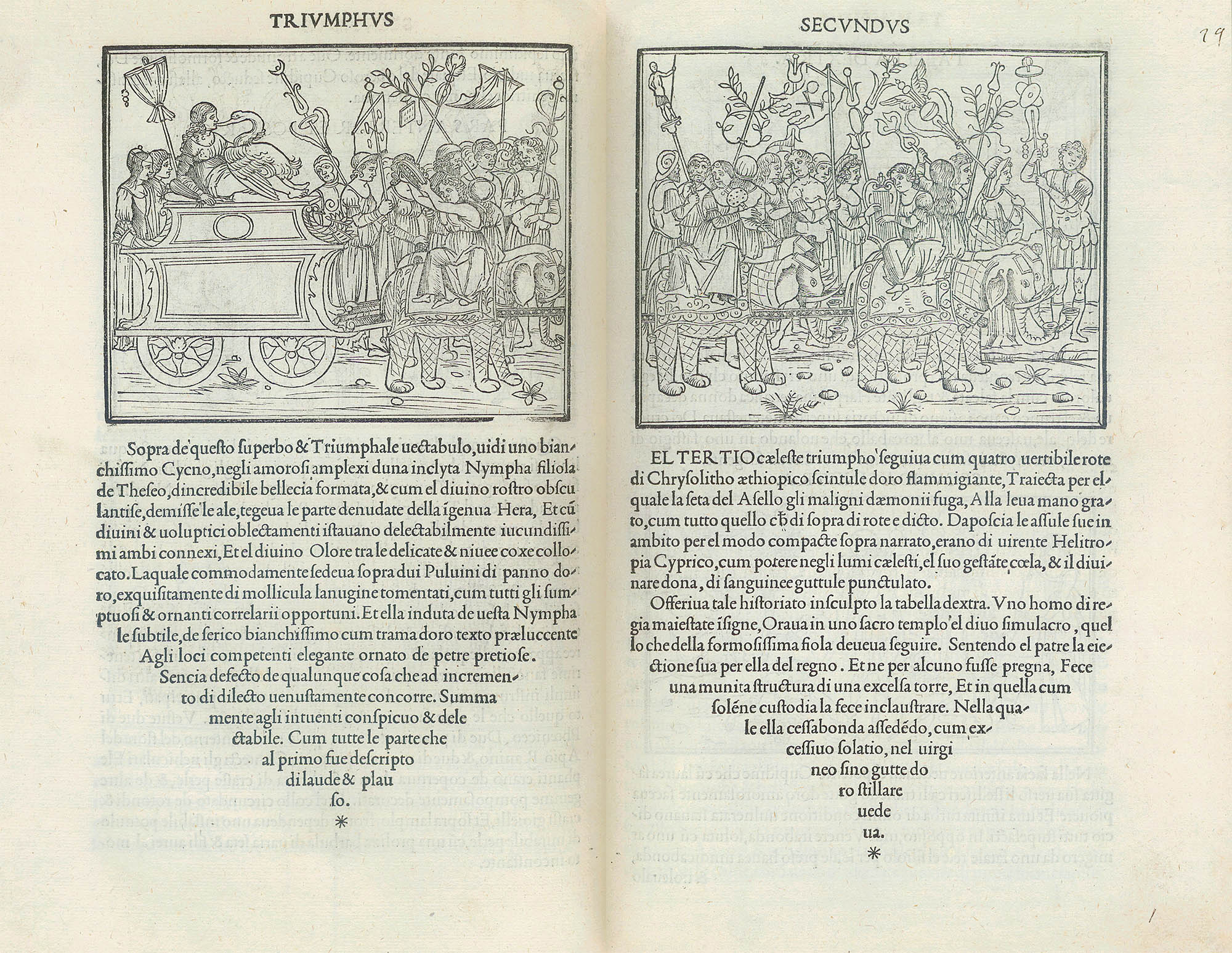
Aldine upper case letters are Roman, derived by Griffo from Roman inscriptions2 and used for the first time in Francesco Colonna’s Hypnerotomachia Poliphili, Not the first illustrated book, nor even the first great illustrated book3, the Hypnerotomachia Poliphili nevertheless represents the talismanic copestone of the incunbula, a beautiful (if also deranged) integration of word and text, printed in December 1499 and dedicated to Guidobaldo da Montefeltro, Duke of Urbino (1472-1508), perfumed and dilettantish son of that old rustbucket, Federico, with his antique vellum library.
—talismanic copestone—
Hypnerotomachia Poliphili, Francesco Colonna, 1499
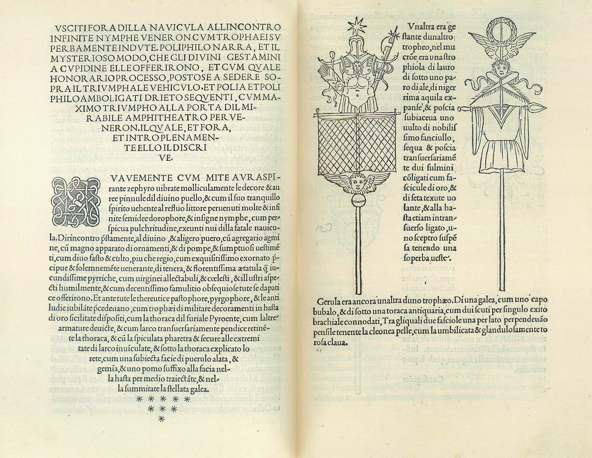
—...beautiful...—
Hypnerotomachia Poliphili, Francesco Colonna, 1499
—...if deranged...—
Hypnerotomachia Poliphili, Francesco Colonna, 1499
It was perhaps ironic that Griffo sought models in Roman inscription, so impure was the Latin of its text: not Latin at all, really, so much as arcane Latin vocabulary drawn from Ovid, Apuleius and Pliny the Elder, shorn of declension or given Italian verb endings, set amidst Italian vernacular syntax and an idiom of feverish love which can only be Petrarchan. Joscelyn Godwin, the work’s English translator, attempts in his introduction to give a flavour of Colonna’s grotesque creole:
“In this horrid and cuspidinous littoral and most miserable site of the algent and fetorific lake stood saevious Tisiphone, efferal and cruel with her viperine capillament, her meschine and miserable soul, implacably furibund.”
The language is so opaque, in fact, as to be more interminable mumbled Hermetic spell than intelligible narrative, portentous, but with nothing much to portend. The book sends its hero (Poliphilo) on an erotic pilgrimage through idealised architectural follies and gardens, in search of the nymph Polia; on his way he delights in and at great digressive length dilates on every material surface which he encounters—of marble and porphyry, of silk and damask—and of every structure, of fountain, temple, automaton, inscription, obelisk. Needless to say, it is all a dream.
But Griffo was perhaps indemnified from the oddities of the language: if his job was to lay out clearly that which is unclear (the text), then there are different sorts of clarity available. Through his work, we peer as though through a limpid glass into the deep-sea strangeness of the Renaissance.
As books go, then, it is a toy, aping the talismanic revelations of a Ficino or a Paracelsus: Egyptological, Classical, Trismegistical, bizarre, arcane. But it marks the end of something. Henceforth, in the century of Martin Luther and Montaigne and Rabelais and Shakespeare, the printed pamphlet, book, tract, play would become an increasingly demotic form. It is not the pseudo-revelations of the text, but Griffo’s chiselled clarity, which will be carried forward.
![]()
It will interest readers to know that Anatomy of Norbiton is set in Garamond, a High Renaissance font named for the French typecutter, Claude Garamond4.
This is not something I would notice myself. A good typeface, after all, aims at invisibility, like Stanley Morison's Times New Roman for instance, of which he said it had the merit that it looked as though it had been designed by no one in particular. A typeset, in the end, is something you look through, not at.
And in any case, Anatomy of Norbiton may be set in Garamond, but on the World Wide Web, typography is moot; text stretches over different-sized screens, typefaces revert in some cases to default sets. On the Web, you lose control of your font. A font is so-named because it is a melted thing, a thing of melted lead, a fondu of type. Fonts are melted now and recast at bewildering refresh rates. To worry about fonts is to enter a niche of old history, in a corner of the Network of All Things, and dwell there unknown, unseen, unread.
![]()
"After the birth of printing books became widespread. Hence everyone throughout Europe devoted himself to the study of literature... Every year, especially since 1563, the number of writings published in every field is greater than all those produced in the past thousand years. Through them there has today been created a new theology and a new jurisprudence; the Paracelsians have created medicine anew and the Copernicans have created astronomy anew. I really believe that at last the world is alive, indeed seething, and that the stimuli of these remarkable conjunctions did not act in vain."
Johannes Kepler De Stella Nova, On the New Star (1606), Johannes Kepler Gesammelte Werke (1937- ), Vol. 1, 330-2. Quoted in N. Jardine, The Birth of History and Philosophy of Science: Kepler's A Defence of Tycho Against Ursus With Essays on its Provenance and Significance (1984), 277-8.
![]()
Bruno Latour understood that magic is merely a practice which operates within a specific set of social and religious institutions. Give a society a church and an afterlife, and a natural order of things not necessarily favourable to most of its members, and it will generate magic.
In the same way, neither a handwritten manuscript nor a printed text is miraculous, or talismanic. There is no such thing as miraculous force operating in the universe, only an equation of contexts which demand a magical term if they are to balance out.
If you peer in close, however, and still closer, at the odd quantum crafting, so to speak, of the font, you might experience a moment of doubt. Here, after all, is an artist at work, the shamanic Griffo, let’s say, mumbling his incantations over his shavings of metal, tied to the shape and balance and interplay of lines no less than any master of disegno, a wild man, a deranged force, who is believed to have bludgeoned his son-in-law to death in 1516, for reasons unknown, and to have hanged for it in 1518.
But shake yourself free of it. Print, unlike art but just like life, is a function of large numbers. Francesco Griffo resolves into a statistic, and printed books do their work in the macrocosmic library.
![]()
Later, we introduce the same small greyscale, ultrasound foetus to its grandfather, the massive beetling Ted Kelley, in his stonecutters’ yard of Poliphian obelisks and fountains. He nods and says, just Ah, that’s magic. Makes sense of everything. He and his daughter talk.
I only half-follow the conversation. I want to ask Kelley about the fonts on his gravestones. One way to anchor words is to chisel them in stone, set them on a gravestone. A word chiselled into granite or marble does not need a semi-colon. Here, says the gravestone, lies an unpunctuated person; a person with no scaffold of days and rituals to hold the various elements—loving father, husband, and grandfather—in place. Is a gravestone like a magical object? A totem? If it is, it exercises a weak magic. Its spells are banal. Those that surround us now, for example, fresh-cut by machine in light stones, untouched by human hand. Printed, as it were, rather than written. They are cheap, throwaway. The tomb of Julius II they are not. But nonetheless, in their singularity, they are more vellum manuscript than quire of printed paper, doomed to erode eternally. They might outlast this little grainy ultrasound, but this ultrasound might very well continue replicating, splitting strands of DNA.
Who knows, I hear Kelley say, what this child will become? He might as well have said, there is no dead child inside us. We are not stratifications, or middens, of our prior selves; we are ever-changing systems, so many walking, talking variorums of Ovid.
I hold the ultrasound image between finger and thumb, and look at it for the first time.
There is nothing to fear.
In Clarke’s remark—that the printed, typeset text contains within it the more volatile spirit of the handwritten thought (so to speak); that a book is, in short, a tomb—he reveals himself: he is a purveyor of romantic fictions, and perhaps therefore himself a Romantic, with all that that entails.
But to set a text well is an exercise in lucidity, not a casting of spells—a text well set will allow the magic to evaporate. Thus as the printed texts emerged from their swaddling, so did their clarity. It was Aldus Manutius and his son who largely standardised punctuation, for example, inventing the semi-colon, better sculpting the comma, placing both in a stable hierarchy with the colon and the full stop. The invisible, the pause, the rest in music: these breathe life into the dead letter, give shape to the breath. What is unread forms that which is read; what is unseen gives body to that which is seen.
Whatever our pre-literate, childish former selves once were, they have undergone a transformation, a mutation. We are translated. Small children are like dancing letters. A lucid gleeful insanity, destined for some letterpress form or other. But any sort of type in a form is equally destined for re-use. Periodic recycling, reshuffling, one moment an ampersand in a polyglot, the next dancing across the page of the Hypnerotomachia Poliphili, or The Life and Opinions of Tristram Shandy, Gentleman. Or tripping digitally across the Anatomy of Norbiton.
Before I formed thee in the belly I knew thee, says the Lord to Jeremiah, foretelling the exile to Babylon. But he didn't. The forms lie open, the sorts of type arrayed in their compartments, the ink and paper lay waiting for shape, form, something visible precipitated out of the potentials of the universe. We are each of us a moveable piece of type, awaiting assembly in a meaningful form. And now here it is. Not magical. Just a meaningful form.
![]()
“¶ Therefore fear not, O my servant Jacob, saith the LORD; neither be dismayed, O Israel: for, lo, I will save thee from afar, and thy seed from the land of their captivity; and Jacob shall return, and shall be in rest, and be quiet, and none shall make him afraid.”
Jeremiah 30:10
—be in rest—
– Jeremiah, Michelangelo Buonarroti